Blog Posts
By Year
20242023
2022
2021
2020
2019
2018
2017
2016
2015
2014
2013
2012
2011
2010
2009
2008
2007
2006
2005
2004
2003
2002
2001
2000
1999
1998
| What now? | [Next Page - I am not worthy] |
| August 12, 2006 [Photos] | |
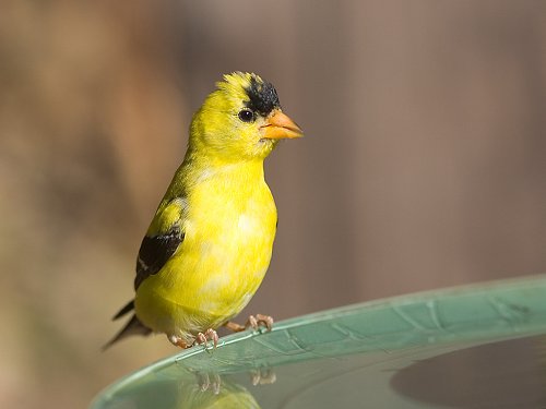
I'll spend hours doing things that a lot of people would find asphyxiatingly boring. But the concept of going to the beach, even though lots of people do it, strikes me as deadly dull. To each his own. Yesterday I took delivery of my new photo blind! (It says "hunting blind" on the box, but I haven't fired a gun in 30 years.) I set up the blind in the back yard and spent this morning sitting in it waiting for the birds to happen by. I know most people would find that boring if not borderline weird. (Or maybe not borderline.) The payoff is I have the best goldfinch photos I've ever gotten, plus shots of a downey woodpecker, house finch, chipmunk, blue jay, and chickadee. These images have been added to the Backyard Habitat gallery. I didn't get any turkey images this morning. I saw three of them skulking 20 yards away in the woods, but the big haystack-looking object must have made them wary of coming into the garden. No big deal. I was really gunning for goldfinches and blue jays today; turkeys are big enough to shoot from the house.
Warning: Technobabble ahead. I've been using Photoshop for a couple of years and have always used Adobe RGB as my working color space. I noticed that my photos were a bit dull on most monitors because they are not capable of displaying the full color gamut of Adobe RGB. I've seen recommendations to switch to ProPhoto RGB because it has an even wider color gamut than Adobe RGB. But when the images were displayed on screen outside of Photoshop, my image colors were even more flat and awful than they had been while using Adobe RGB. Hmmm. I don't print most of my images, so why process them as if I was? I have the color management book I bought couple of years ago and I've read parts of it, but it still seems hopelessly confusing. So I just tried different settings to see what worked. I'm getting decent results by using ProPhoto RGB during the RAW conversion process and using a Photoshop working space of sRGB, which the typical monitor can handle easily. As I said, it's confusing, but this shot of Chip shows much better color saturation on screen than when I was using Adobe RGB for both RAW conversion and working space.
So the moral of the story is to use a Photoshop working space of sRGB when preparing images for screen display. Now I have to figure out what to do if I want to print them. | |

Top Menu | Destinations | Years | Species | Aircraft, etc. | Blog | Contact Info
All photos ©1998-2024 by Thomas O'Neil